Line
Lines are used to make shapes and divide space:


sketch by Robert Fawcett
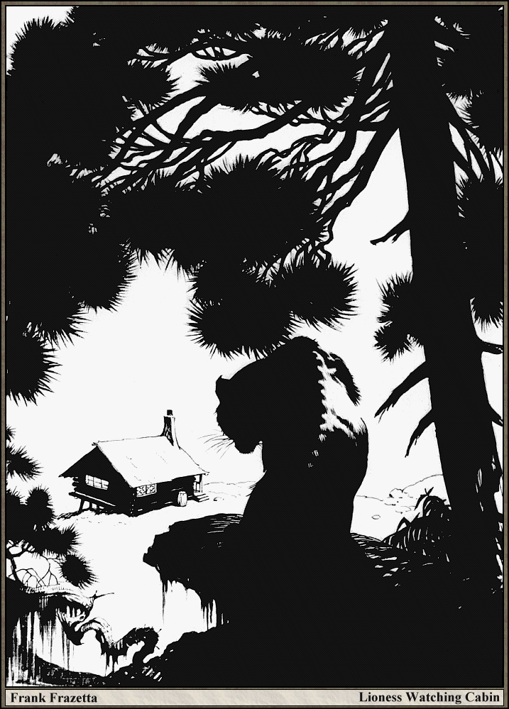
The lines that form the outline or silhouette of a shape or object are called contour lines:


Shape/Form

Focal Point


 Having said that, it can be fun to play with extreme size differences:


Proportion


Looking at negative shapes can help you to draw more accurately, finding and staying in proportion:


.jpg)


hue - a colour's position on a colour wheel
chroma - it's intensity or saturation
value/tone (odtien) - it's range from light to dark. Value is also present when colour isn't.


sketch by Austin Briggs
Contour lines can be quite sophisticated, dividing shapes according to different planes or according to the light source:

sketches by Gue Yang

illustration by Tom Scheuer
There are many kinds of lines. You can make a complex composition simply by using a variety of lines:

"Boats at Sea" by Vincent Van Gogh
You can also create lovely abstractions just with lines:

"Cataract no. 3" by Bridget Riley
Sometimes you don't even have to draw a line for people to see it, all you have to do is suggest it:

sketch by Anthony Holden
Shape/Form
shapes and forms are pictorial figures made from lines.

Shape and form are synonymous. They're basically just blobs. They may represent real things, or they may be abstract. There are some textbooks and teachers who will argue that shapes are two dimensional (2D) while forms are 3D. I think it's fair to agree they have these associations - sculptors use the word 'form' when casting plaster molds of their work. But you can use the words interchangeably and people will understand you. Stan Prokopenko explains in his fundamentals video that artists improve as their shapes become more sophisticated and accurate:

Shapes can greatly affect the mood of a piece. We have strong emotional connections to shapes, depending on their size, texture, and so on. I talk about this more in this lesson.
Focal Point
This is a center of interest that pulls your eyes towards it.

"Familia Llorando" by Eduardo Chicharro Agüera
(Do you see the focal point?)
Focal points are made up of lines and-or shapes that stand out - due to various effects, such as isolation:

"The Widow" by Harry Anderson
contrast:

"The Boulder" by Charles Courtney Curran
framing it:

"Ella's Hotel, Richfield Center" by Otto Bacher
brighter color (a form of contrast, also coupled here with a spotlight):

"The Circus" by George Bellows
greater detail and-or focus, etc.

This flower is the classic focal point for a photograph, leaving the background a blur. With photography, you often have to choose a focal point, because you can't always get everything in focus.

Painters often do the same thing ("Gala Day at Newlyn, Cornwall" by Stanhope Forbes)
Faces in figurative art are often focal points because we look to an expression to help explain the story - whatever's happening in the piece. This desire can outweigh any other compositional devices.

illustration by Jason Chan
Hands also make good focal points:

"Opportunity Makes the Thief" by Paul Chocarne-Mureau
An artwork may have more than one focal point, although juggling more than three in a picture can be difficult - add too many focal points, and you end up with none:

I'm actually in this photo :D
Also note, the natural desire of the viewer to understand a piece can outweigh certain pictorial effects:

Also, beware that focal points can compete with each other:

"View From the Village" by Jean Bazille
What's the main focus of this picture? The detailed, high-contrast town, or the poor girl below, wondering why you don't look at her?
I talk more about focal points in this lesson.
Volume

Volume, a term we borrow from science, suggests a 3D form - the idea of being able to reach in and grab a solid object. Volume also suggests weight, because solid forms are heavy. A volume isn't a shape. When we talk about a "volume of water" it could have any shape, but the main thing is it's 3D. If a shape or form in a painting "has volume" it appears 3D. It isn't flat. If a sculpture has lots of volume, it is 3D - you might think that's obvious, but some sculptures are very thin.
Mass
Mass

Mass, another term borrowed from science, is the opposite of empty space and is similar to volume. When people talk about the volume of a shape, they're talking about how it looks. When people talk about the mass of a shape, they're talking more about its weight. It's like two sides of the same coin. The word 'massive' means huge.

Size
Size is a powerful tool in your art box, the key options being large and small.

"Levitated Mass" by Michael Heizer
Size
Size is a powerful tool in your art box, the key options being large and small.

"Hello Up There" by Amy Lind
It's important to remember that...
The shapes in your work don't have to be extremely different in size. People will see them in relation to each other. So, a little circle is still huge compared to the dot next to it.
...size is relative.
The shapes in your work don't have to be extremely different in size. People will see them in relation to each other. So, a little circle is still huge compared to the dot next to it.


"Stone Giant" by Layne Johnson
Also note, that size doesn't merely refer to the figures in a work, but the size of the work itself, which may be tiny:

coin paintings by Bryanna Marie
or monumental:

"The Guanyin of Nanshan", in China
Proportion
Proportion is what controls your shapes. It determines how tall, short, thin, or fat they are. Proportion is extremely important in realism. When drawing realistically you don't have to copy every detail you see - you're not a meat camera. But you do need to accurately see and copy the proportions, using your eye as a ruler and protractor, to measure lengths and angles.
Everything you see has specific proportions - but some are easier to play with than others. For example, there's not one universal proportion for trees and bushes. They come in all shapes and sizes.

People come in a variety of sizes as well, but there are still many proportional rules you must follow to create realistic figures and portraits. And it's confusing - many art books maintain the human body is so many heads tall (usually 7 1⁄2). An "idealized" body may be 8 heads tall.

From Andrew Loomis's book on Anatomy
The reality is often different:


I'll prepare an in-depth lesson on human proportions at a later date.
Space
Space is the area around your shapes. Positive space is made up of objects, and negative space is the empty area behind your objects.

Looking at negative shapes can help you to draw more accurately, finding and staying in proportion:


There are also many creative ways to use positive and negative space to create:
.jpg)
Poster by Simon C. Page

comic panel by Eric Canete

by M. C. Escher
Colour
Colour is pretty,

except sometimes when it's ugly:

In America, we spell it "color". It's worth considering what makes some colours beautiful or ugly - it mostly has to do with how they work together (or don't). Every colour has the potential to be really beautiful, depending on how it's used and what it's paired with.
Boulders Near Bear Cliff, by Charles Courtney Curran
except sometimes when it's ugly:
village church, by Chaim Soutine
(would you like some mustard with your painting today?)
In America, we spell it "color". It's worth considering what makes some colours beautiful or ugly - it mostly has to do with how they work together (or don't). Every colour has the potential to be really beautiful, depending on how it's used and what it's paired with.
The three elements of colour are:
hue - a colour's position on a colour wheel
chroma - it's intensity or saturation
value/tone (odtien) - it's range from light to dark. Value is also present when colour isn't.

Colours can be flashy and help make artworks more memorable, because they tap into our emotions and memories. I talk more about the psychology of colour in this lesson.
Texture
Texture
Texture is the look and feel of a material. It can be rough or smooth, sharp or soft, flat or glossy, etc.
Contrast
Contrast just means difference. People naturally see differences. If you open Photoshop or similar computer programs, you may think contrast is just about light and dark, but it's not. To quote illustrator Tristan Elwell:
"There are many different kinds of contrast, not just contrast of value. There's also contrast of hue, chroma, size, direction, texture, detail, etc. You use as many of these as possible (depending on your medium) to make the viewer look where you want them to. You can also use some to balance or compensate for others."
Molly Bang explains in her book, The Principles of Composition, that contrast is what enables us to see. Without contrast, everything would be an even fog of grey.
Perspective
Perspective is a trick of geometric design to create the illusion of 3D space on a 2D surface, based on a horizon line and vanishing points. There are different kinds of perspective, varying in complexity. To draw realistically you must learn to see and draw in perspective.
symmetry & balance
Symmetry is the division of space into smaller identical spaces and shapes. There are different kinds of symmetry. Most often, it functions like a mirror. There is also radial symmetry. Balance also divides pictorial space, but the resulting shapes are not identical. Balance suggests symmetry without being exact. It's more relaxed.
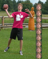
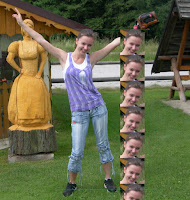
repetition & rhythm
Repetition is when you repeat the same or similar line or shape several times in an artwork. Rhythm has to do more with where you put these repeated shapes and what line or shape is made when you look at them all together.
symmetry & balance
Symmetry is the division of space into smaller identical spaces and shapes. There are different kinds of symmetry. Most often, it functions like a mirror. There is also radial symmetry. Balance also divides pictorial space, but the resulting shapes are not identical. Balance suggests symmetry without being exact. It's more relaxed.
repetition & rhythm
Repetition is when you repeat the same or similar line or shape several times in an artwork. Rhythm has to do more with where you put these repeated shapes and what line or shape is made when you look at them all together.
No comments:
Post a Comment