All artworks are born from the same creative process. First, you make something, and then you have to correct it. Mistakes are inevitable. Finding and fixing them is not. Let's learn to recognize some common mistakes in landscapes. Many of these problems are common to all picture making.
As a side note, don't think of the following as rules, so much as bullies who want to ruin your artwork. It's your job to fight back and make them work for you. You need to be dictator and supreme ruler of your artwork.
LET THERE BE LIGHT
Take a look at this painting.

Kari paa Sunde, by Nicolai Astrup
There's a vague indication of sunlight in the yellow mountain, and the green tree on the right. So, where's the light in the foreground? If the foreground is in shadow, let's say covered by clouds, then where's the transition between light and shadow in the fields? Now, I'm not saying this painter is a beginner, or that he even cared about light/shadow in this piece, but I am saying it doesn't work, and for that reason. Ignore light and shadow at your peril! Let's see what happens when I add some real light and shadow in the picture:

Any better? Is it a little less flat? Easier to read? Is the girl in the foreground a little more important, now that she's in the light?
One issue with light is remembering where the light source is. So long as you draw and paint from observation, you should be fine. But when you start painting from imagination, even a veteran like Bob Ross can sometimes paint two different light sources from opposing sides, as if the Earth had two suns:
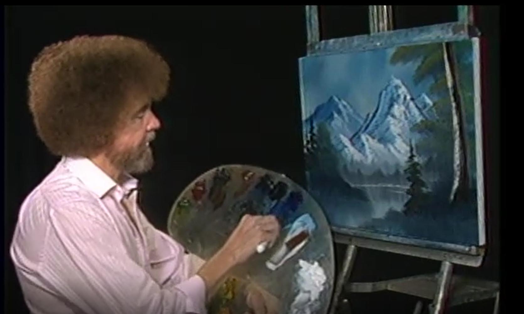
Look at the light on the mountain, versus the light on the tree...
Come on, Bob, this isn't Tatooine...
Here's another example. Notice how grey everything feels here?

Pod Krivanom, by Rudolf Dollinger
This painting's okay, but it's value neutral - there are no darks or lights. Probably it's just a bad photo of the painting, but still, there needs to be light and dark. Just increasing the value contrast makes a vast improvement:

Now it looks more believable.
GRAVITY
Another beginner mistake has to do with painting subjects that appear to be falling over. Mr. Kearns refers to this as a "down trip". Some students assume trees are always perpendicular to the ground, even on hills:

example by Mr. Kearns
The result looks a bit like the melting permafrost up in Canada, that causes trees to fall over:

There's no method or technique that will make this look pretty.
A forest with one or two fallen trees is beautiful, so long as it looks natural. But, unless you want to frighten your viewer with trees that are about to fall on him, you might want to have them stand up straight - no matter how steep the hill:

The Valley of Lauterbrunnen, by Alexander Calame
TANGENTS
I talk more about tangents under my lesson "Principles of Composition - Shapes". Tangents can flatten your picture, and ruin your sense of perspective, but there's also another danger. When you draw a line, like a road for example, that curves toward the frame, and then bounces back, the effect is to draw viewers' eyes out of the picture all together. It's like a magnet, pulling your eyes away from the center:

example by Mr. Kearns

Flooding of the Seine, by Maurice de Vlaminck
PAREIDOLIA
It's important to remember how easily people see and understand abstract symbols.

We see this as a person drinking water, and that's amazing.
Even when you flip it over, you still see a person, although his body kind of looks like a hand now:

How astronauts drink water in space
It's more confusing, but you still see a person, possibly being attacked by a vacuum cleaner, or small car.

Now, he's drinking from a urinal!
Humans are great at reading symbols. We see them everywhere, and we're especially good at seeing faces:

All you need is two dots and something below and you have a face:


So imagine how you'd feel, how I felt, when I painted this winter scene...

only to find one of the trees was yelling at me:

Pareidolia is one of those things where, once you see it, you can't un-see it. So, be careful, as you find lines and shapes and shadows in your trees and landscapes, that they don't start shouting at you.
Also remember that pareidolia can work for you, if you do it purposefully. Salvador Dali incorporated it into many of his paintings:

L'Amour de Peirrot, by Salvador Dali
PAINTING POTATOES

So, potatoes are great, when cooked right. Everyone loves potatoes. But, how do they look? I mean, when's the last time you heard someone say, "Wow, look at this beautiful potato!" I'm not saying it isn't possible:

Potato Study, by Michael Vladimir Nicolayeff
But it's not common, right? Well, unfortunately, a lot of beginners paint potatoes in their landscapes. Again, Mr. Kearns has provided some examples

A gathering of "potato" rocks along a stream

"potato" clouds.
There are two problems happening here. First, these shapes are inaccurate, stemming from a kind of visual blindness/laziness that passes with practice. It's the kind of thing beginners do when painting from imagination. More importantly, even when you do see clouds like this, remember, they're not elegant shapes. Here's how a real artist sees and draws rocks in a river:

"Bachbett im Böhmerwald", by Edmund Kanoldt
And here's how a great artist paints clouds:


GREAT PAINTING - WRONG CANVAS
Here's a problem that comes from poor planning. You go outside and find a great subject to paint. You get started, and then you realize... Oh, I still have blank areas on my canvas, and now I have to fill it in. Stapleton Kearns refers to this as "foreground follies", where people spend equal amounts of time painting the random crap at their feet as the main subject of their painting:

this example was made by Stapleton Kearns to illustrate the problem...

...and how to fix it.
So, think about your canvas shape and everything that will go into it before you start.
Just to be clear, the problem here isn't always about painting the foreground. It's about painting what you and others want to see. No one wants to see the trash in the picture above. But, when your foreground is filled with a beautiful field of flowers, then, by all means, paint it:

In Poppyland, by John Otis Adams
DIVIDE AND FAIL
Many artists will warn you not to create a line that cuts an artwork in half. The danger is it will distract viewers, because it'll feel like there are two different pictures on one canvas. Now, every realistic image naturally divides at a horizon line, whether you draw it or not. So the real danger has more to do with vertical lines bisecting your picture:

Acantilado, by Juan Martinez-Abades
What's the subject of this picture? Are we supposed to look at the cliff on the right, or is it actually blocking our view of the water behind it? Also notice the lighthouse at the top touches the frame - a tangent. Stapleton Kearns gave a good name for this problem - "one for each eye":

example by Mr. Kearns
Notice, each tree is exactly the same size, distance, and contains the same compositional weight. When neither is more important, your eyes jump back and forth endlessly, never really resting anywhere. You might look at this and think, "Hey, it's balanced!" Unfortunately, it's too well balanced.
PICTURE PROFILING
A profile is a side view - of anything. Profiles in portraiture can be exquisite:

"Giovanna Tornabuoni", by Domenico Ghirlandaio
But, do you notice how it flattens the subject? She looks a bit like a queen on a playing card, and not just because of her outfit. A 3/4 view makes a person pop out of the picture:

"Erin", by Sean Cheetham
This painting also shows a young woman placed against a flat wall, yet it contains a great illusion of space and depth. It does so for a variety of reasons, and one of them is that she turned her head. Also, note how Erin feels a lot more relaxed than Giovanna. When someone stands or sits in profile, it's not so comfortable. It's something we do in formal situations, where we need to be polite, but all we really want to do is stretch.
Landscapes work in just the same way. Take a look at these paintings:

Banks of the Missouri, by Clyde Aspevig

Yerres, Part of the South Façade of Casin, by Gustave Caillebotte

Via Sacra in Rome, by Christoffer Eckersberg

Interior with a Seated Girl, by Carl Holsoe

Moonlight Bay, by Marc Hanson
Some of these I really like. I think Holsoe used the profile perspective well to emphasize the discomfort you might feel being alone in a dark room, full of nice furniture. His paintings are about stillness and quiet, which you mustn't disturb. You want to tiptoe through them.
But, the other artists, who I greatly admire, really should've picked a better view, and Marc Hanson, an excellent artist, apparently just wanted to paint that sky, and everything in the foreground was an afterthought. It can be as simple as walking 50 feet to the right or left, and then turning - just enough of a change in angle so that you see the same subject from an angle. The result is a view that gives you greater depth and a greater sense of place:

"Village in Laurentian Mountains" by Clarence Gagnon
Notice how ever single building is turned so you see two sides of it?
That's not an accident.
FLATLANDS AND EMPTY SKIES
That last painting by Hanson brings me to another dilemma. It's a sad fact that, while clear blue skies are wonderful in real life, they can be rather dull to look at:

I found this on a blog, titled boring landscape
Some places in the world are flat and featureless, like the photo above, showing a highway in Idaho. Some of the best artists in history have lived in relatively flat and boring places, like southern England and the Netherlands. This didn't keep them from making great art:

Haarlem and Bleaching Fields, by Jacob Isaaksz van Ruisdael

Mending Nets by the Shore, by Hermanus Koekkoek
Low Lighthouse & Beacon Hill, Harwich, by John Constable

Going to the Hayfield, by David Cox

On the Snake River, Oregan, by Childe Hassam
As you can see, when you're an artist clouds are your friends, especially at sunset:
Memories, by Marc Hanson
This is a situation where you have to wait for the weather to provide the right subject. You can't just go out in bad i.e. boring weather, and paint an empty landscape, devoid of any real subject, contrast, or interest. As Mr. Kearns says, if your painting:

(Again, Mr. Kearns's example)
would look better with a burning phone booth:

then it's a bad painting.
COMPOSING AN 'L'
So, if you've studied your principles of shapes, you know that it's common to place your subject just outside the center of your picture, to free the eyes so they can wander around a bit. Fine, but then you have to have other areas of interest! If there's nothing else to see but your contrived 'L' then there's no reason to let your eye wander, and you instead have a bad painting.

Example by Mr. Kearns
Many artists have painted L's. Some are successful and some aren't, and it depends in part whether there are secondary and tertiary focal points. But, more importantly, does it feel honest? Or does it seem like you just threw it together because you thought it would make a safe composition? Let's take a look at some L's that I feel are more successful:

The Ruins of Tuscany, by James Brevoort

A Walk by the Lake, by Alfred Bricher

The Saco River from Conway, by Alfred Bricher
...and some less successful L's:

Blodget Peak, by William Bancroft

Tropical Sunset, by Elizabeth Jerome

The Catskills from the South Side of Mount Merino, by Henry Ary

Palms at Sundown, by Franklin Briscoe
Do you agree that these last paintings feel artificial? Does the placement of these trees feel thoughtless? So, if an art teacher ever tells you it's good to paint L's, remember, they can be good, but it's no guarantee.
BEAKS AND STRIPES
Finally, these last two mistakes arise when painting water - rivers, lakes, any water with a far shore. The first is painting "three stripes".

example by Mr. Kearns
Imagine for a second if the above painting were finished, with beautiful blues and greens. Could it be a good painting? Well, first of all, what we're seeing is a profile view, with all the same problems listed above. Secondly, it's just three boring lines. And thirdly, our view is too narrow to know what we're viewing. Is it a pond? a lake? a river? a harbour? There's not enough information to tell. This is another case where you need to get up, walk around, and find a better view that's more descriptive. This is also a time where adding diagonal lines will help tremendously:

"Twilight Flight" by Del-Bourree Bach
This is also a case where adding some subjects, like boats, and a dramatic sky make all the difference:

"Sunset at Gloucester" by Winslow Homer
This is also a situation where you must consider your canvas shape. Seascapes generally work much better with a long, narrow canvas, to mimic the feel of turning your head to take in the view:

"The Wave" by Thomas Alexander Harrison
A beak is what happens with you paint a bit of land over water, ending on one side. Like potatoes, it's not a very elegant shape:

example by Mr. Kearns
Squint your eyes. Do you see a profile of a bird's head? There are ways to avoid this. Mr. Kearns illustrates how to depower this shape through light and shadow:

Another way is to look for a more elegant island or peninsula:

Marina Grande, Capri, by Charles Dix

Low Tide, Southhead, Grand Manan Island, by Alfred Bricher
These are all the common mistakes I know. If you can learn to avoid them in your art, then congratulations, you're on your way to becoming great.
Thanks for these examples. I'm not sure what a profile views in a landscape is. How is the first picture under "peaks and stripes" an example of a profile view?
ReplyDeleteGreat question, and I'm sorry I took so long to answer. It's a bit confusing because with most objects in space, it's hard to say where the "face" is. So you could be looking at an object in profile, or simply head on. Either way, the effect is identical to an "elevation" architectural drawing. That's probably the way I should've explained it. But, basically, all the lines of the object are horizontal. None of it is coming towards you. Once you find an angle with diagonal lines, you start getting a feel of near and far, the picture begins to pop, and a place like a pond becomes a bit more recognizable. I should've added, water scenes generally need a different canvas shape (a longer one) to better describe them.
Delete